
Workshop Series
- Workshop 1: Build with Kiro: Prompt-First Product Design for a Tagalog Learning App
- Workshop 2: Build with Kiro: Educational-First Dev Tips for a Tagalog Learning App
- Workshop 3: Build with Kiro: Deep-Dive Development Flow for a Tagalog Learning App
- Workshop 4: Build with Kiro: Localize a Tagalog Learning App into Chinese Variants Workshop
- Workshop 5: Build with Kiro: Grammar and Pronunciation Enrichment Pipeline for Tagalog Cards Workshop
- Workshop 6: Build with Kiro: Unique and Reviewable Extra Examples in a Tagalog Learning App Workshop
- Workshop 7: Build with Kiro: Rebuild the CME Direct-Style Quant P&L Leaderboard UI
- Workshop 8: Build with Kiro: Recreate the Quant Analytics Engine Behind the P&L Board
- Workshop 9: Build with Kiro: AWS AI-Powered Trading Desk Assistant for the Quant Board
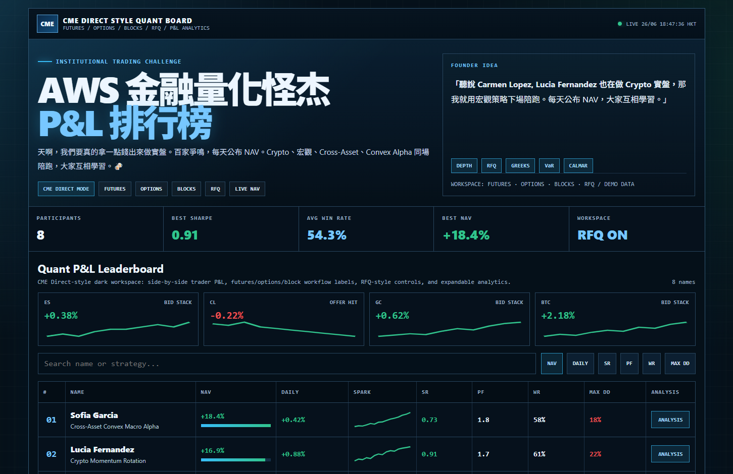
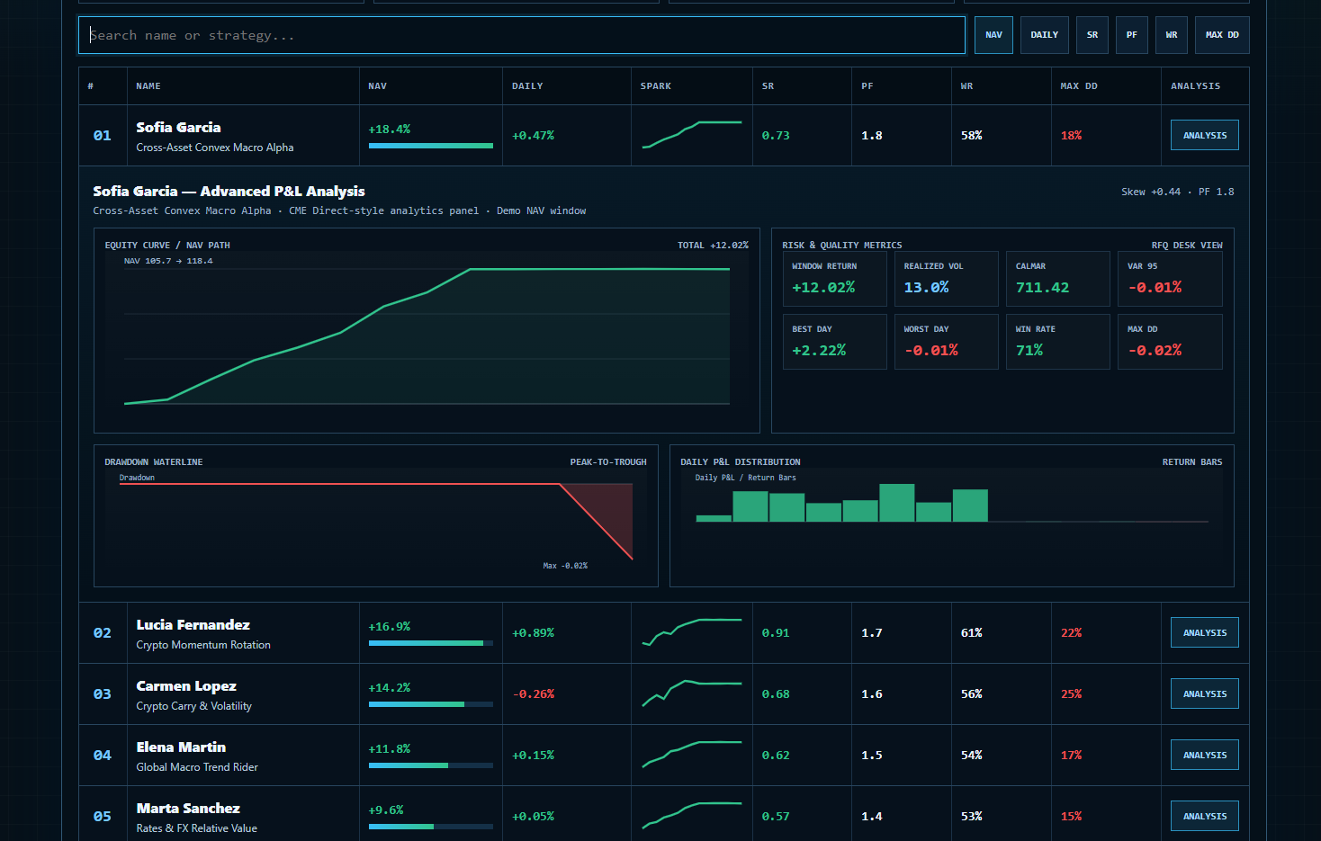
Summary: This standalone workshop teaches professional developers to rebuild the uploaded CME Direct-style quant leaderboard as a React and TypeScript application using Kiro. Developers learn spec-driven UI decomposition, dark-mode design tokens, responsive grid conversion, accessible search and sort controls, reusable market cards, leaderboard rows, expandable analysis panels, and Kiro hooks for UI consistency, documentation, and regression testing with production-quality learning outcomes.
Workshop purpose
This 2-hour workshop focuses on the frontend system design of the demo. Developers will convert the single-file HTML/CSS/JavaScript implementation into a maintainable React + TypeScript application while preserving the trading-workspace user experience: top bar, hero, status stats, market tiles, controls, leaderboard rows, expandable analysis panels, SVG chart containers, footer disclaimer, responsive layouts, and live clock behavior.
The learning goal is not just to “copy UI.†The goal is to teach developers how to use Kiro spec-driven development, steering files, and hooks to convert a dense prototype into production-ready component boundaries.
Demo coverage map
This workshop covers these parts of the uploaded HTML demo:
- Page shell:
.page,.terminal, dark grid background, radial highlight background. - Sticky top bar: CME logo, product name, workflow subtitle, live green status dot, HKT clock.
- Hero:
Institutional Trading Challenge, Chinese title, subhead, workflow chips, founder idea card. - Summary statistics: Participants, Best Sharpe, Avg Win Rate, Best NAV, Workspace RFQ ON.
- Market strip: ES, CL, GC, BTC cards with “BID STACK†and “OFFER HIT†labels.
- Controls: search box and sort buttons for NAV, DAILY, SR, PF, WR, MAX DD.
- Leaderboard grid: rank, name, strategy, NAV, daily return, sparkline, SR, PF, WR, Max DD, Analysis.
- Expandable detail panel container layout.
- Responsive breakpoints at desktop, tablet, and mobile.
- Footer disclaimer and CTA.
Target developers
- Frontend developers building financial dashboards.
- Full-stack developers modernizing prototype HTML into a typed app.
- UI engineers learning how Kiro can help with specs, steering, hooks, and refactoring.
- Developers who need to preserve financial UI meaning while improving maintainability.
Two-hour agenda
| Time | Module | Developer output |
|---|---|---|
| 0:00-0:10 | Inspect demo and create project | UI inventory and React scaffold |
| 0:10-0:25 | Kiro steering | Product, design-system, accessibility, finance-ui rules |
| 0:25-0:40 | Kiro spec | Requirements, component tree, responsive strategy |
| 0:40-1:05 | Layout shell | dark terminal frame, top bar, hero, stats |
| 1:05-1:25 | Market + controls | market cards, search, sort button group |
| 1:25-1:45 | Leaderboard rows | typed rows, responsive labels, progress bars |
| 1:45-1:55 | Expandable panel placeholders | analysis slots and footer disclaimer |
| 1:55-2:00 | Kiro review | UI consistency backlog |
Architecture
React application
├─ src/app/App.tsx
├─ src/styles/tokens.css
├─ src/styles/layout.css
├─ src/data/demoBoard.ts
├─ src/components/TopBar.tsx
├─ src/components/HeroPanel.tsx
├─ src/components/StatsStrip.tsx
├─ src/components/MarketStrip.tsx
├─ src/components/LeaderboardControls.tsx
├─ src/components/LeaderboardTable.tsx
├─ src/components/TraderRow.tsx
├─ src/components/AnalysisPanelShell.tsx
└─ src/components/FooterDisclaimer.tsx

Kiro workspace
├─ .kiro/steering/product.md
├─ .kiro/steering/ui-design-system.md
├─ .kiro/steering/accessibility.md
└─ .kiro/specs/leaderboard-ui/
   ├─ requirements.md
   ├─ design.md
   └─ tasks.md
Financial and trading-workspace terms used in this UI
| Term | Demo definition | How it affects trading decisions |
|---|---|---|
| P&L | Profit and Loss; displayed as daily percentage movement and cumulative leaderboard return. | Helps traders identify whether a strategy is making or losing money in the current market context. |
| NAV | Net Asset Value; the demo starts each strategy around 100 and shows percentage gain such as +18.4%. | Used to rank cumulative performance, but must be evaluated with drawdown and risk quality. |
| Futures | Standardized exchange-traded derivatives referenced by labels such as ES, CL, GC. | Traders use futures to express macro views and hedge exposures. |
| Options | Derivatives with nonlinear payoff; shown as workflow context in the top subtitle. | Options introduce Greeks, convexity, and volatility decisions. |
| Blocks | Large negotiated trades; shown as workflow context. | Relevant for liquidity and market-impact decisions. |
| RFQ | Request for Quote; displayed as a workflow chip and RFQ ON workspace status. |
Indicates quote-driven execution workflow where liquidity and pricing quality matter. |
| BID STACK | Market tile label for upward/positive market state. | Suggests buy-side depth or positive pressure in the demo display. |
| OFFER HIT | Market tile label for negative market state. | Suggests selling pressure or offers being executed. |
| SR | Sharpe Ratio; risk-adjusted quality score. | Helps compare strategies with different volatility. |
| PF | Profit Factor; gross winners divided by gross losers. | Helps identify whether winners meaningfully overcome losses. |
| WR | Win Rate; percentage of positive periods. | Useful for consistency but must be compared with payoff size. |
| Max DD | Maximum Drawdown; worst decline from running peak. | A key defensive metric for risk limits and capital allocation. |
Step 1 — Scaffold the React app
npm create vite@latest kiro-cme-quant-board -- --template react-ts
cd kiro-cme-quant-board
npm install
npm install -D vitest @testing-library/react @testing-library/jest-dom
mkdir -p .kiro/steering .kiro/specs/leaderboard-ui src/components src/data src/styles
Business logic: The original demo is a single HTML file. That is useful for fast prototyping, but professional developers need separable components so the trading board can evolve without high regression risk.
Code logic: Vite provides a fast TypeScript React baseline. The folder structure separates application composition, component rendering, demo data, and CSS tokens.
Expected result: npm run dev starts an empty React application that Kiro can inspect and modify.
System design rationale:
- A local React app is selected because the workshop is 2 hours and must focus on extracting UI architecture, not cloud deployment. Developers can still later deploy the static build to Amazon S3 and CloudFront if needed.
- The project separates
data,components, andstylesfrom the beginning. This prevents Kiro from generating one large component that mixes trading data, rendering logic, and design tokens. - The test dependency is installed at the start because accessibility and rendering tests should be part of the migration, not added after the UI is complete.
Step 2 — Add Kiro steering files
Create .kiro/steering/product.md:
# Product overview

Build a CME Direct-inspired quant P&L leaderboard for developer education.
The UI shows demo trading analytics only and must not be presented as investment advice.
Preserve the original concepts: Futures, Options, Blocks, RFQ, live NAV, P&L analytics, market tiles, sortable leaderboard, and expandable analysis.
Create .kiro/steering/ui-design-system.md:
# UI design system

Use dark terminal styling with cyan, green, red, yellow, muted blue-gray, and monospace metric text.
Use CSS variables for tokens.
Keep visual hierarchy: topbar -> hero -> stats -> market strip -> controls -> board -> footer.
Use responsive breakpoints equivalent to desktop, tablet, and phone.
Create .kiro/steering/accessibility.md:
# Accessibility rules

All search inputs need labels.
Sort buttons need accessible names and active state.
Analysis buttons must show expanded/collapsed state with aria-expanded.
Do not rely only on color for positive/negative values; keep plus/minus symbols.
Prompt sample for Kiro
Read the steering files and create a spec for converting the single-file CME Direct-style quant board into React components. Preserve layout sections, dark design tokens, responsive behavior, sort/search controls, analysis expansion, market cards, and footer disclaimer. Generate requirements, component design, and implementation tasks.
Business logic: Steering tells Kiro which prototype details are mandatory: workflow labels, statistics, search, sorting, and disclaimer. This keeps the AI from simplifying away domain meaning.
Code logic: Steering files are Markdown instructions Kiro applies across future code generation. The design-system file directly influences generated CSS and component boundaries.
Expected result: Kiro produces a componentized plan rather than rewriting the demo as another large file.
System design rationale:
- Product steering and design steering are separated because product requirements describe what must be preserved, while design-system steering describes how it should look and behave.
- Accessibility is treated as a first-class steering file because financial dashboards are often keyboard-driven, and traders may consume data quickly under pressure.
- The steering files intentionally include the original section hierarchy, so Kiro can map each prototype block into a component and avoid accidental loss of features.
Step 3 — Capture demo data for the UI
Create src/data/demoBoard.ts:
export type TraderRow = {
    name: string;
    strategy: string;
    navPct: number;
    dailyPct: number;
    sharpe: number;
    profitFactor: number;
    winRatePct: number;
    skew: number;
    maxDrawdownPct: number;
    series: number[];
};

export type MarketTile = {
    symbol: 'ES' | 'CL' | 'GC' | 'BTC';
    move: string;
    state: 'BID STACK' | 'OFFER HIT';
    up: boolean;
    series: number[];
};

export const traders: TraderRow[] = [
    { name: 'Sofia Garcia', strategy: 'Cross-Asset Convex Macro Alpha', navPct: 18.4, dailyPct: 0.42, sharpe: 0.73, profitFactor: 1.8, winRatePct: 58, skew: 0.44, maxDrawdownPct: 18, series: [100,101,100.7,102.2,104,103.2,105.7,106.1,108,109.8,111,112.4,114.9,116.2,118.4] },
    { name: 'Lucia Fernandez', strategy: 'Crypto Momentum Rotation', navPct: 16.9, dailyPct: 0.88, sharpe: 0.91, profitFactor: 1.7, winRatePct: 61, skew: 0.31, maxDrawdownPct: 22, series: [100,102.1,101.5,103.8,102.9,106.4,108.2,107.5,110.8,112.2,111.6,114.1,115.2,116,116.9] },
    { name: 'Carmen Lopez', strategy: 'Crypto Carry & Volatility', navPct: 14.2, dailyPct: -0.31, sharpe: 0.68, profitFactor: 1.6, winRatePct: 56, skew: 0.22, maxDrawdownPct: 25, series: [100,99.4,101.7,103.2,104.8,103.7,106.8,108.9,110.4,109.2,112.6,113.8,115.1,114.8,114.2] },
    { name: 'Elena Martin', strategy: 'Global Macro Trend Rider', navPct: 11.8, dailyPct: 0.17, sharpe: 0.62, profitFactor: 1.5, winRatePct: 54, skew: 0.18, maxDrawdownPct: 17, series: [100,100.8,101.1,102.5,103.2,104,103.8,105.4,106.2,107,108.9,109.3,110.2,111.1,111.8] },
    { name: 'Marta Sanchez', strategy: 'Rates & FX Relative Value', navPct: 9.6, dailyPct: 0.09, sharpe: 0.57, profitFactor: 1.4, winRatePct: 53, skew: 0.09, maxDrawdownPct: 15, series: [100,100.2,99.9,101,101.8,102.5,102.2,103.6,104.1,105.4,106,106.8,108.2,109,109.6] },
    { name: 'Paula Romero', strategy: 'Equity Factor Ensemble', navPct: 7.1, dailyPct: -0.12, sharpe: 0.49, profitFactor: 1.3, winRatePct: 52, skew: -0.04, maxDrawdownPct: 14, series: [100,100.5,101.2,100.8,102.1,102.7,103.4,104.2,103.8,105,105.4,106.2,106.8,107.3,107.1] },
    { name: 'Ana Torres', strategy: 'Commodity Breakout System', navPct: 5.4, dailyPct: 0.28, sharpe: 0.42, profitFactor: 1.2, winRatePct: 51, skew: 0.12, maxDrawdownPct: 19, series: [100,99.1,100.4,101.6,100.8,102.2,101.5,103.4,102.8,104.2,103.8,104.7,105.1,105.2,105.4] },
    { name: 'Laura Navarro', strategy: 'Multi-Asset Mean Reversion', navPct: 3.8, dailyPct: -0.06, sharpe: 0.35, profitFactor: 1.1, winRatePct: 49, skew: -0.11, maxDrawdownPct: 16, series: [100,100.4,99.8,100.9,101.4,100.6,101.8,102.2,101.7,102.8,103.1,102.9,103.6,103.9,103.8] }
];

export const markets: MarketTile[] = [
    { symbol: 'ES', move: '+0.38%', state: 'BID STACK', up: true, series: [20,21,20,22,23,23,24,25,24,26] },
    { symbol: 'CL', move: '-0.22%', state: 'OFFER HIT', up: false, series: [30,29,31,28,27,26,25,24,23,22] },
    { symbol: 'GC', move: '+0.62%', state: 'BID STACK', up: true, series: [18,18.5,19,18.7,20,21,20.5,22,23,23.5] },
    { symbol: 'BTC', move: '+2.18%', state: 'BID STACK', up: true, series: [20,22,21,24,26,25,29,28,32,34] }
];
Business logic: This preserves all participant and market-tile information from the demo while giving developers a typed source of truth.
Code logic: The data module uses TypeScript types for trader rows and market tiles. Components import typed arrays rather than reading DOM or parsing embedded script data.
Expected result: The UI can render all 8 participants and 4 markets without hardcoded values inside components.
System design rationale:
- Data is placed in a module because prototype data and rendering are mixed in the original single file. Extracting it is the first step toward maintainable architecture.
- The field names clarify units:
navPct,dailyPct, andwinRatePctare percentages, whileseriescontains indexed NAV points. This prevents confusion during formatting. - The market tile type limits valid symbols to the four demo instruments, which helps Kiro generate safer code and reduces accidental typos in component props.
Step 4 — Create CSS design tokens
Create src/styles/tokens.css:
:root {
    --bg: #061018;
    --panel: #081522;
    --panel2: #0c1f31;
    --line: #28465f;
    --soft: rgba(40,70,95,.62);
    --text: #edf6ff;
    --muted: #9fb3c8;
    --cyan: #38bdf8;
    --cyan2: #77c7ff;
    --green: #31c48d;
    --red: #f05252;
    --yellow: #f6c85f;
    --mono: ui-monospace, SFMono-Regular, Menlo, Monaco, Consolas, "Liberation Mono", monospace;
    --sans: -apple-system, BlinkMacSystemFont, "Segoe UI", Roboto, "Noto Sans TC", "Noto Sans SC", Arial, sans-serif;
}

body {
    margin: 0;
    min-height: 100vh;
    color: var(--text);
    font-family: var(--sans);
    background:
            linear-gradient(rgba(255,255,255,.025) 1px, transparent 1px),
            linear-gradient(90deg, rgba(255,255,255,.025) 1px, transparent 1px),
            radial-gradient(circle at 10% 0, rgba(56,189,248,.2), transparent 30%),
            radial-gradient(circle at 88% 10%, rgba(49,196,141,.12), transparent 26%),
            var(--bg);
    background-size: 32px 32px, 32px 32px, auto, auto, auto;
}

.metric { font-family: var(--mono); font-variant-numeric: tabular-nums; font-weight: 900; }
.pos { color: var(--green); }
.neg { color: var(--red); }
.cyan { color: var(--cyan2); }
Business logic: Design tokens preserve the institutional trading terminal look while making the visual language reusable.
Code logic: CSS variables replace repeated hex values. Components can use .metric, .pos, and .neg consistently for financial numbers.
Expected result: The application matches the dark-grid, cyan/green/red trading-board aesthetic.
System design rationale:
- CSS variables are used instead of component-local colors so visual changes can be made in one place. This is important for a dashboard that may need brand or accessibility tuning.
- Metric text uses tabular numerals because financial values should align visually when rows update. This improves readability under live updates.
- Positive and negative classes are named by semantic meaning rather than color. That makes the design easier to adapt for non-red/green themes or color-blind modes.
Step 5 — Build top bar and hero components
Create src/components/TopBar.tsx:
import { useEffect, useState } from 'react';
export function TopBar() {
const [clock, setClock] = useState('LIVE');
useEffect(() => {
const tick = () => setClock(`LIVE ${new Date().toLocaleString('zh-HK', {
hour12: false, month: '2-digit', day: '2-digit', hour: '2-digit', minute: '2-digit', second: '2-digit'
})} HKT`);
tick();
const id = window.setInterval(tick, 1000);
return () => window.clearInterval(id);
}, []);
return <header className="topbar">
<div className="brand"><div className="logo">CME</div><div>
<div className="brand-main">CME DIRECT STYLE QUANT BOARD</div>
<div className="brand-sub">FUTURES / OPTIONS / BLOCKS / RFQ / P&L ANALYTICS</div>
</div></div>
<div className="status"><span className="dot" />{clock}</div>
</header>;
}
Create src/components/HeroPanel.tsx:
export function HeroPanel() {
const chips = ['CME DIRECT MODE', 'FUTURES', 'OPTIONS', 'BLOCKS', 'RFQ', 'LIVE NAV'];
const quoteChips = ['DEPTH', 'RFQ', 'GREEKS', 'VaR', 'CALMAR'];
return <section className="hero">
<div className="hero-grid">
<div>
<div className="eyebrow">Institutional Trading Challenge</div>
<h1>AWS 金èžé‡åŒ–怪æ°<br /><span>P&L 排行榜</span></h1>
<p className="subhead">天啊,我們è¦çœŸçš„拿一點錢出來åšå¯¦ç›¤ã€‚百家çˆé³´ï¼Œæ¯å¤©å…¬å¸ƒ NAV。Cryptoã€å®è§€ã€Cross-Assetã€Convex Alpha åŒå ´é™ªè·‘,大家互相å¸ç¿’。ðŸ»</p>
<div className="chips">{chips.map(c => <span key={c} className={c === 'CME DIRECT MODE' ? 'chip hot' : 'chip'}>{c}</span>)}</div>
</div>
<aside className="quote">
<div><div className="quote-label">Founder Idea</div>
<p><strong>「è½èªª Carmen Lopez, Lucia Fernandez ä¹Ÿåœ¨åš Crypto 實盤,</strong>那我就用å®è§€ç–ç•¥ä¸‹å ´é™ªè·‘ã€‚æ¯å¤©å…¬å¸ƒ NAV,大家互相å¸ç¿’。ã€</p></div>
<div><div className="chips">{quoteChips.map(c => <span key={c} className="chip hot">{c}</span>)}</div>
<div className="quote-foot">WORKSPACE: FUTURES · OPTIONS · BLOCKS · RFQ / DEMO DATA</div></div>
</aside>
</div>
</section>;
}
Business logic: The top bar and hero tell users the trading-workspace context before they inspect numbers. The text frames the board as a learning competition with demo or internal analytics.
Code logic: TopBar owns clock state and cleanup. HeroPanel is static and renders chips and quote content from arrays.
Expected result: The top of the app visually matches the original demo with live status, HKT clock, title, Chinese copy, founder quote, and workflow chips.
System design rationale:
- Clock logic is isolated in
TopBarbecause it has a timer side effect. Keeping side effects local makes testing and cleanup easier. - Hero content is componentized even though it is static because product copy often changes independently from the rest of the trading board.
- Workflow chips are arrays rather than repeated JSX to make it easy for Kiro or developers to add or reorder labels without editing layout structure.
Step 6 — Build stats strip, market strip, controls, and table
import { markets, traders } from '../data/demoBoard';

export function StatsStrip() {
    const bestSharpe = Math.max(...traders.map(t => t.sharpe));
    const avgWinRate = traders.reduce((s, t) => s + t.winRatePct, 0) / traders.length;
    const bestNav = Math.max(...traders.map(t => t.navPct));
    return <section className="stats">
        <div className="stat"><div className="stat-label">Participants</div><div className="stat-val">{traders.length}</div></div>
        <div className="stat"><div className="stat-label">Best Sharpe</div><div className="stat-val pos">{bestSharpe.toFixed(2)}</div></div>
        <div className="stat"><div className="stat-label">Avg Win Rate</div><div className="stat-val cyan">{avgWinRate.toFixed(1)}%</div></div>
        <div className="stat"><div className="stat-label">Best NAV</div><div className="stat-val pos">+{bestNav.toFixed(1)}%</div></div>
        <div className="stat"><div className="stat-label">Workspace</div><div className="stat-val cyan">RFQ ON</div></div>
    </section>;
}

export function MarketStrip() {
    return <div className="market">{markets.map(m => <div className="mcard" key={m.symbol}>
        <div className="mhead"><span>{m.symbol}</span><span>{m.state}</span></div>
        <div className={m.up ? 'mval pos' : 'mval neg'}>{m.move}</div>
    </div>)}</div>;
}
Business logic: Summary stats provide a fast portfolio-desk overview before individual rows. Market tiles show broad context for equity index, oil, gold, and Bitcoin proxy markets.
Code logic: Stats are derived from trader data, not hardcoded. Market cards map over typed market data.
Expected result: The UI displays 8 participants, best Sharpe 0.91, average win rate 55.8%, best NAV +18.4%, RFQ ON, plus four market cards.
System design rationale:
- Summary stats are computed so they remain correct if demo rows change. This avoids stale header numbers.
- Market tiles are separated from leaderboard rows because they represent environmental context, not participant performance.
- Workspace status is kept as a static indicator in this workshop because RFQ workflow is a label, not a real trading connection.
Step 7 — Add Kiro hooks for UI quality
Create .kiro/hooks/ui-regression-review.md:
# Hook: UI regression review

Trigger: when src/components/*.tsx or src/styles/*.css is saved
Action:
Ask Kiro to check whether the change preserves: topbar, hero, stats, market strip, search, sort buttons, leaderboard columns, expandable analysis, responsive labels, dark tokens, and disclaimer.
Create .kiro/hooks/accessibility-review.md:
# Hook: accessibility review

Trigger: when src/components/*.tsx is saved
Action:
Ask Kiro to review keyboard access, input labels, aria-expanded, active sort state, and positive/negative value semantics.
Business logic: UI regression hooks help protect prototype coverage. Developers are less likely to remove a feature accidentally during refactor.
Code logic: Hooks run Kiro review prompts on file-save events. They do not replace unit tests, but provide immediate agent-assisted review.
Expected result: Kiro recommends fixes when a component loses a label, removes a required section, or breaks interaction semantics.
System design rationale:
- UI migration has many small details, so file-save review catches regressions when context is still fresh.
- Accessibility review is separated because visual parity does not guarantee keyboard or screen-reader quality.
- Hooks are advisory, not automatic code rewriting, because developers should control changes to financial dashboard behavior.
Final lab challenge
Ask Kiro:
Compare the React UI with the original single-file demo inventory. Produce a gap list covering layout sections, chips, market tiles, controls, leaderboard columns, responsiveness, live clock, disclaimer, and analysis panel placeholders. Then generate implementation tasks for remaining gaps.
Completion checklist
- All 8 traders and 4 market cards are represented.
- Sticky top bar and HKT live clock work.
- Hero, founder quote, chips, and footer disclaimer are present.
- Stats strip computes values from data.
- Search and sort controls are accessible.
- Leaderboard columns match the demo.
- Responsive layout covers desktop/tablet/mobile.
- Kiro hooks review UI and accessibility changes.
Source demo reference
This workshop is based on the uploaded aws_quant_pnl_leaderboard_v3.html demo. The demo includes a CME Direct-style dark workspace, participant leaderboard, market cards, sortable/searchable P&L board, advanced analytics panels, chart functions, responsive CSS, live HKT clock, and simulated periodic NAV updates. All data is treated as demo placeholder data and not investment advice.
Additional Hands-on Developer Labs for Advanced Developers — HTML Graphic Analysis
These labs extend the UI workshop with a deeper analysis of the uploaded HTML file's visual system. They focus on the graphic construction of the dark trading workspace: layered backgrounds, gradients, terminal framing, color semantics, responsive composition, visual hierarchy, and CSS-driven affordances. They do not repeat the base React migration or the analytics-engine labs.
Advanced graphic-analysis goals
By the end of this section, advanced developers will be able to:
- Reverse-engineer the HTML file's visual grammar into reusable design tokens.
- Explain how the grid background, glow effects, borders, and panels create a CME Direct-style terminal feel.
- Build a visual inventory that maps CSS selectors to graphic intent.
- Validate responsive graphic behavior at desktop, tablet, and mobile breakpoints.
- Create Kiro review prompts that preserve visual fidelity while refactoring.
Graphic inventory from the HTML file
The uploaded HTML uses a compact but rich graphic system:
- Terminal frame:
.terminalcreates a bounded trading workspace with border, dark translucent background, and large box shadow. - Layered body background: multiple linear gradients create a subtle grid, while radial gradients create cyan and green light blooms.
- Sticky command bar:
.topbar,.logo,.status, and.dotestablish live-workspace affordance. - Hero composition:
.hero,.hero-grid,.eyebrow,h1,.chips, and.quotedefine the dashboard's brand story and workflow context. - Metric color language:
.pos,.neg,.cyan, and.metricencode positive, negative, highlight, and tabular numeric text. - Board density:
.row,.cell,.rank,.strategy,.barwrap, and.barcreate a dense financial grid. - Responsive transformation: media queries at
1120pxand560pxtransform the board from table-like grid to mobile row cards.
Advanced Lab 1 — Build a visual-token extraction report
Objective: Convert the HTML's CSS values into a documented design-token report that explains each color, font, spacing, border, shadow, and background layer.
Create docs/html-graphic-token-report.md:
# HTML Graphic Token Report

## Color tokens

| Token | Value | Graphic role |
|---|---:|---|
| --bg | #061018 | Workspace background |
| --panel | #081522 | Primary panel surface |
| --panel2 | #0c1f31 | Raised control surface |
| --line | #28465f | Grid and border system |
| --cyan | #38bdf8 | Interactive glow and primary highlight |
| --green | #31c48d | Positive metric state |
| --red | #f05252 | Negative metric state |
| --yellow | #f6c85f | Reserved warning accent |

## Typography

- `--mono` is used for metrics, controls, status, and dense trading labels.
- `--sans` is used for body copy, hero text, and strategy descriptions.
- `.metric` enables tabular numeric scanning through `font-variant-numeric: tabular-nums`.

## Surface language

- Dark panels are separated with `--line` borders.
- Soft internal dividers use `--soft` to reduce visual noise.
- Cyan glow is reserved for active controls, hero emphasis, and live workspace identity.
Kiro prompt:
Analyze the uploaded HTML CSS and create a design-token report. Explain the visual purpose of every root variable, major panel color, border, shadow, font family, metric class, and positive/negative state. Keep the report implementation-oriented for React developers.
Expected result: Developers can describe the original graphic system before changing it.
Advanced Lab 2 — Reconstruct the layered background as a component
Objective: Isolate the HTML file's grid-and-glow background into a named React shell class so it can be tested and reused.
Create src/components/GraphicWorkspaceShell.tsx:
import type { ReactNode } from 'react';

export function GraphicWorkspaceShell({ children }: { children: ReactNode }) {
  return (
    <main className="page graphic-workspace" id="top">
      <section className="terminal graphic-terminal">{children}</section>
    </main>
  );
}
Create src/styles/graphic-background.css:
.graphic-workspace {
  min-height: 100vh;
  background:
    linear-gradient(rgba(255,255,255,.025) 1px, transparent 1px),
    linear-gradient(90deg, rgba(255,255,255,.025) 1px, transparent 1px),
    radial-gradient(circle at 10% 0, rgba(56,189,248,.2), transparent 30%),
    radial-gradient(circle at 88% 10%, rgba(49,196,141,.12), transparent 26%),
    var(--bg);
  background-size: 32px 32px, 32px 32px, auto, auto, auto;
}

.graphic-terminal {
  border: 1px solid #315875;
  background: rgba(4,14,23,.95);
  box-shadow: 0 26px 90px rgba(0,20,36,.72);
}
Graphic logic: The first two gradients create the grid. The next two radial gradients create atmospheric cyan and green depth. The final color layer anchors the dark terminal environment.
Kiro prompt:
Extract the HTML body background and terminal frame into named React/CSS shell classes. Preserve the exact gradient order, background-size behavior, frame border, translucent terminal surface, and box shadow. Add comments that explain the graphic role of each layer.
Expected result: The background becomes a portable visual primitive rather than an undocumented body style.
Advanced Lab 3 — Create a visual hierarchy annotation overlay
Objective: Add a development-only overlay that labels visual sections: topbar, hero, stats, markets, controls, board, detail panels, and footer.
Create src/dev/VisualHierarchyOverlay.tsx:
const zones = [
  ['topbar', 'Command / live status'],
  ['hero', 'Narrative identity and workflow chips'],
  ['stats', 'Desk-level summary metrics'],
  ['market', 'Market context strip'],
  ['controls', 'Search and ranking controls'],
  ['board', 'Dense P&L table'],
  ['footer', 'Disclaimer and navigation'],
] as const;

export function VisualHierarchyOverlay() {
  return (
    <aside className="visual-audit-panel" aria-label="Visual hierarchy audit panel">
      <h3>Graphic hierarchy</h3>
      <ol>
        {zones.map(([selector, role]) => (
          <li key={selector}><code>.{selector}</code> — {role}</li>
        ))}
      </ol>
    </aside>
  );
}
Add development CSS:
.visual-audit-panel {
  position: fixed;
  right: 12px;
  bottom: 12px;
  z-index: 99;
  width: min(360px, calc(100vw - 24px));
  border: 1px solid var(--line);
  background: rgba(4, 16, 26, .94);
  color: var(--text);
  padding: 12px;
  font-family: var(--mono);
  font-size: 11px;
}
Expected result: Developers learn to inspect the page as a hierarchy of graphic zones, not just a list of components.
Advanced Lab 4 — Responsive graphic behavior audit
Objective: Verify that the HTML's two breakpoints preserve visual meaning when the board changes shape.
Create docs/responsive-graphic-audit.md:
# Responsive Graphic Audit

## Desktop view

- Board header row is visible.
- Ten-column grid supports trader comparison.
- Hero uses two-column composition.
- Market strip uses four columns.

## Tablet view, max-width 1120px

- Hero, chart grids, and risk grids collapse to one column.
- Stats become two columns.
- Market cards become two columns.
- Board header is hidden and each row exposes mobile labels.

## Phone view, max-width 560px

- Status text and brand subtitle are hidden to protect space.
- Stats and markets use single-column cards.
- Sort buttons become a two-column grid.
- Footer CTA stacks below the disclaimer.
Kiro prompt:
Create a responsive graphic audit from the uploaded HTML. For each breakpoint, document which visual structures change, why the change protects readability, and what regression tests should verify.
Expected result: Responsive design is treated as graphic behavior, not just CSS mechanics.
Advanced Lab 5 — Visual regression checklist for the HTML look
Objective: Create a checklist that developers can use before accepting UI refactors.
Create docs/html-look-regression-checklist.md:
# HTML Look Regression Checklist

## Must preserve

- Dark grid body background with cyan and green glow layers.
- Terminal border and deep shadow.
- Sticky topbar with live green dot.
- Large high-contrast hero title with cyan secondary line.
- Workflow chips with normal and hot states.
- Dense metric typography with tabular numbers.
- Positive values with plus signs and green color.
- Negative values with minus signs and red color.
- Board row dividers and soft internal cell separators.
- Mobile labels when the header row disappears.
- Footer disclaimer visibility.

## Must not introduce

- Real market-data claims.
- Trading recommendations.
- Color-only meaning without textual sign or label.
- Breakpoint behavior that hides the disclaimer or analysis button.
Kiro prompt:
Compare the React UI against the uploaded HTML graphic system. Produce a regression checklist covering background, frame, topbar, hero, chips, stats, market cards, controls, board rows, responsive labels, detail panels, and footer disclaimer.
Advanced final challenge — HTML graphic fidelity review
Ask Kiro:
Perform a graphic fidelity review of the React UI against the uploaded HTML file. Focus only on visual system behavior: background layers, terminal frame, color semantics, typography, spacing, hierarchy, responsive breakpoints, dense board layout, focus states, and disclaimer visibility. Produce a severity-ranked gap list.
Advanced graphic-analysis completion checklist
- Design-token report explains the HTML visual system.
- Background and terminal frame are extracted into named reusable classes.
- Visual hierarchy overlay documents the page's graphic zones.
- Responsive audit covers both breakpoint tiers.
- Regression checklist protects the original look and non-advisory footer.